From Spike to SQL
From a change in database activity to the responsible SQL—in seconds
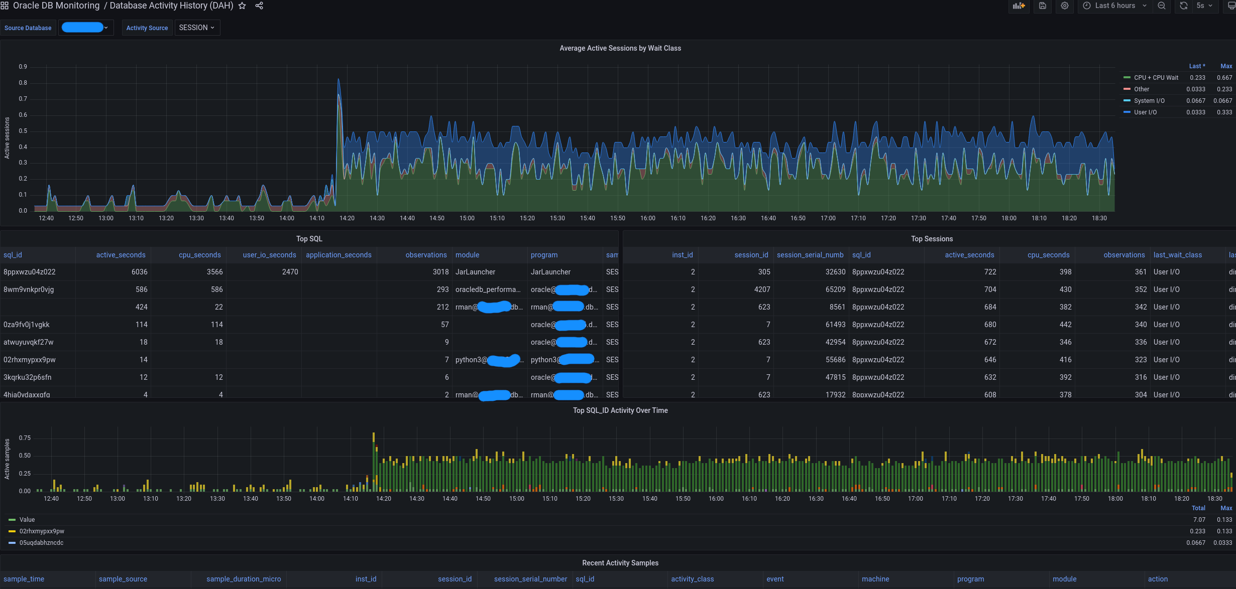
At 14:17, the database workload changes abruptly.
The Database Activity History dashboard makes it impossible to miss: a quiet system suddenly moves into a sustained period of CPU and User I/O activity. This is not an isolated spike. Something started, and it kept the database busy.
The obvious next question is:
What started at 14:17?
One click into TOP Consumers provides the answer.
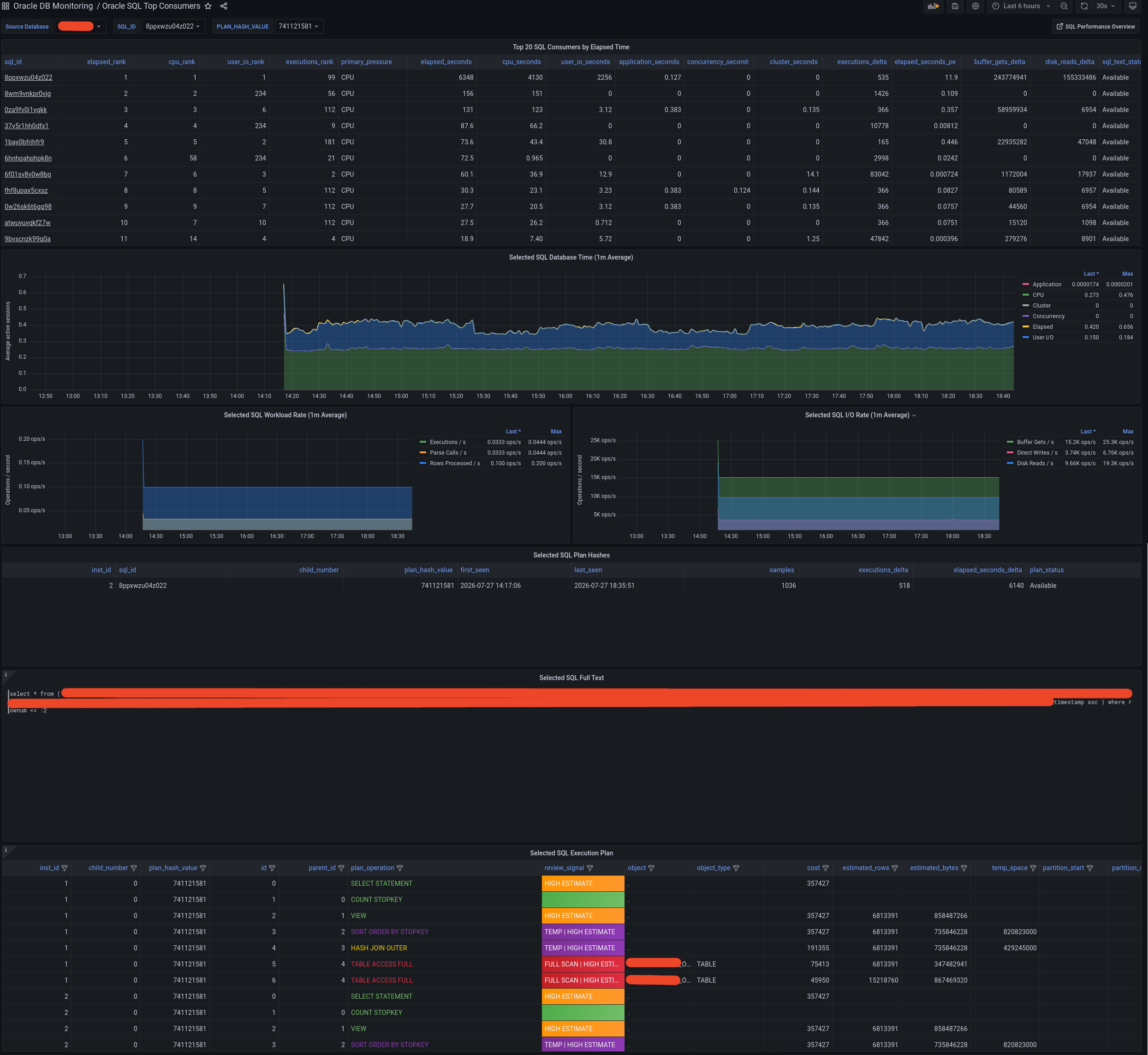
The leading SQL is selected automatically, and its database-time graph reproduces the same unmistakable shape: the initial peak, the immediate transition and the sustained workload beginning at exactly the same moment.
The shape of the workload is its fingerprint.
And Harry does not stop at identifying a SQL_ID.
The same dashboard exposes the complete chain of evidence:
- the SQL ranked first by elapsed time, CPU and User I/O;
- the exact workload generated by that statement;
- execution rate, buffer gets, disk reads and direct writes;
- the complete SQL text;
- the plan hash and captured execution plan;
- and problematic operations—such as
FULL TABLE SCAN, high estimates and temporary-space pressure—visually highlighted.
No jumping between unrelated tools. No manually rebuilding the timeline. No waiting several minutes for Oracle Enterprise Manager to move from one screen to another.
With Grafana, the transition from “the database became busier” to “this SQL caused it, and this is what its execution plan is doing” took seconds.
See it. Identify it. Explain it.
This is the difference between merely displaying database activity and making it actionable.
DAH shows when the workload changed. TOP Consumers shows what caused it. The SQL text and execution plan show where to investigate next.
Same start time. Same workload shape. One dominant SQL. Full scans in red.
Blanco y en botella.